Sunday 28 February 2010

Linen vs. silk

So, damp-stretched and mounted on boards, here are the two contenders (linen on the left, silk matka on the right):


On the face of it, they look much the same, but I need to make a decision on which one to use. Looking at the pros and cons of each:-

Linen pros:
  • Easier - doesn't require stitching through from the back as the transfer's on the front.
Linen cons:
  • As the transfer's on the front, it's still visible in places unless I'm very accurate
  • Even if I am, transfers still smudge when you iron them on sometimes, and the bigger the transfer, the greater the chances of smudging.
Silk pros:
  • Any design lines left over can be picked out.
Silk cons:
  • Will take quite a lot longer, as the transfer will need to be stitched through from the back.
So, the obvious conclusion is to use the linen, and take extra care when applying the transfer. So you won't be too surprised to hear that I'm going for the silk!

Partly this is to get round any potential problems with the transfer, but if I'm honest, it's mostly because I just like it better. I love the way that it has a rough, coarse appearance, but is actually beautifully soft, and lovely to work with. I think it gives a nice contrast to the smooth gold thread, and even if some of the design-transferring stitches are still visible when I'm finished (most likely round the centre, if my test piece is anything to go by), then the orangey thread gives a warm hint to it, rather than the cool blue of any visible transfer pencil.

Yes, I know it's going to take me twice as long to do, but I don't care. It's how I want to do it. I've ordered the fabric.

One more quick test: when couching the gold thread, I only stitched over it at the points where threads crossed, so that the main lengths were smooth and unbroken. Unfortunately, this led them to wiggle slightly; stretching them onto some mount board solved that, but I'll be making hangings, which won't be stretched, so that's not going to help, and nor is the fact that most of the Spirograph designs are a lot bigger than this. They need to be stitched down far more frequently. But I still want the smooth unbroken look. This is a problem.

As a test, I've tried couching some gold passing thread with 'invisible' nylon thread. I've never used this before so how come I have a reel of it in my thread stash I don't know, but here's how the experiment looked:


This is exactly the look I'm after, but there is a downside: this thread is horrible to work with, it really is. It's not thread at all, it's a very fine plastic wire, and I hate it. So I now have to decide whether to go for the look I want and use the nasty nylon stuff or sacrifice some of the smoothness and use normal thread. I really don't know which way to go on this one.

Friday 26 February 2010

Fabric test: silk matka

Following the linen test, I also needed to try the same design on my other proposed fabric, so I could compare the two. The second test is on a raw silk fabric called matka; this is what I used recently for Kate's Crow, though in this case I'm back to the parchment/sandy colour I used for the calligraphy cushions.

As I mentioned in a previous post, I'd ironed the Spirograph design transfer onto a piece of cream linen. I used this to back the matka; not only does this strengthen the fabric, it also allows me to transfer the design to the front using running stitches.

Here's half the Spirograph design stitched through to the front fabric. You may have to look closely!


It was clearer in real life, though to be honest not much. This was actually the third thread I tried - both the others (a gold-yellow and a brown) looked fine on the reel but were almost invisible once against the fabric, and had to be unpicked. This terracotta shade stood out just enough to be usable but not enough to be really obvious under the goldwork coming along next.

And the goldwork was what I now did. This was exactly the same as for the linen version: a single passing thread couched down with a gold-coloured sewing thread. So not to give myself too much of a headache trying to follow the running-stitched lines I decided to do this in two lots, so here's the first batch all nicely couched:


This is just half the design, though, so I went over the rest of it in the running stitches next:


That's next to impossible to see, so here's a close-up that's a little clearer, if not much:


You'll just have to take my word for it that the running stitches were there, and I went over them too with the gold passing thread, giving the final piece:


This method certainly works, but I'm hardly making life easy for myself with it. Stitching through from the back almost doubles the work, and unless I choose a really strong colour for the tacking thread, which I don't want to do or I'll have to pick all of it out again once the goldwork is done, which is even more work, it's not easy to see against this background.

Both it and the linen test need to be damp stretched and then stretched onto some mount board (the goldwork isn't couched closely enough to work well without being under some tension). I've already decided which fabric I'm going to use, though. Which one would you go for?

Sunday 21 February 2010

Fabric test: linen

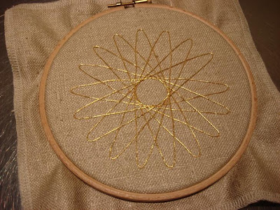
With the transfer ironed onto the right side of the natural linen, I can get straight on with couching the gold thread. I put the linen into a hoop to work; I generally prefer frames, but this is quite a small piece and a hoop is more convenient.

One gold passing thread is couched down with a gold-coloured sewing thread, and is stitched directly over the transfer lines.


I'd intended to use a single length of the thread directly off the spool for this, to minimise starting and finishing off of ends, but I ran out of the thread on the spool I was using and so had to finish it off part way through and start a new one anyway. The best laid plans!

Here's the finished item:


It looks pretty good, though something that hasn't really shown up in the photo is that you can see blue through the lattice of threads in the centre, where the transfer is showing through. Also, despite my best efforts to stitch precisely over them, the transfer lines are also visible in some places. In a piece that can be washed that's not a problem as the transfer will just wash out, but with something that can't, such as this, it's a bit more of an issue.

I've gone down with s streaming cold, so the silk matka test is going to have to wait until I'm feeling a bit better. I always get two colds a year, one in the spring and one in the autumn, so this is right on schedule. I just wish I could say the same about the spring!

Thursday 18 February 2010

Spirograph hangings - preparation for fabric tests

So, I have the designs for the hangings, but I need to decide which fabric to use. The look I'm after is for a sandy/neutral background, with the designs couched in gold. The gold is straightforward enough - I'll use the same gold passing thread I always do - but what about the background?

I've narrowed it down to two, and will stitch the same design onto both and see which I think works best. The fabrics I'm looking at are a natural linen, and silk matka (the same fabric I used for Kate's Crow) in a sand shade.

To do this, I used the simplest of the Spirograph spirals from the hanging designs, and traced it with a transfer pencil to make an iron-on transfer. (The tracing paper is such an odd shape as I never throw any usable bits away on the grounds that they'll come in handy for something eventually. And this one did!)


Transfers made with a decent quality pencil can be used several times, so I just needed to make the one to be ironed onto two pieces of fabric, a square of natural linen, and another square of cream linen, to be used as a backing to the silk.

I always stitch the transfer in place rather than pinning it, as then I can iron the whole of the paper and fabric without anything catching. I also find that the transfer is less likely to shift when it's tacked down. I do leave a gap somewhere, though, so I can check how well the transfer is coming off onto the fabric without needing to remove it.


I ironed it onto the natural linen first, as that's the darker colour, and I thought that if there was any loss of quality, it would be better to have the transfer at its best on this one, though as it turned out they were much the same.


I've neatened the edges, as you can see, and I've attached the matka to the front of the cream linen, so now I'm ready to start stitching!

Tuesday 16 February 2010

Exhibition - wall-hangings

I've been giving a great deal of thought to my proposed exhibition, and I've decided that the heart of it will be three wall-hangings. These will work together a set, but also alone (should anyone want to buy one!). They'll be in goldwork, and I'd also like to do smaller or nué panels or pictures to accompany them, but I'm still a bit vague on the details for them.

I do, however, now have designs I'm happy with for the hangings. About a year ago, on a whim, I bought an old Spirograph from eBay. I'd had one as a kid but it's long gone, and I'd probably lost half the bits anyway. I messed about with it for a while, then moved onto other things.

I didn't entirely forget about it, though, and it occurred to me that the spiral shapes (why do I have this thing about spirals of one sort or another?) could look good in goldwork. The Spirograph spirals reminded me of chrysanthemums in Japanese prints, and I've been working on layouts inspired by them, though more abstract.

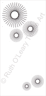
All three hanging designs are below. The positioning of the spirals on each one I did using Photoshop Elements, but the spirals themselves I drew by hand using the Spirograph set, scanned and resized. You can still see dots on the designs, which is where the pins went in the plastic wheels!

So, here they are:

Spirograph I:


Spirograph II:


Spirograph III:


All three will be 60 x 120cm.

I know the effect I want, but I need to make a decision on fabrics, so a bit of experimenting is in order.

Sunday 14 February 2010

Vote for me!

No, I'm not going to be standing in the general election, but you can still vote for me in the craft&design magazine Selected awards, to find the best designer-makers in the UK and Ireland in a variety of categories, including textiles. The public vote is open until 30 April, so if you'd like to vote for me, go to www.craftmaker.co.uk/rutholeary/ and follow the link at the bottom of the page. Given the incredible standard of the work in Selected I don't think I'll win, but I suppose you never know!

In a round-up of other news, Kate's Crow has been stretched onto a board and finished off neatly with a plain black backing; I'll be packing it off to Brian the blacksmith tomorrow. I've been working on designs for the centre of my proposed exhibition and am a lot happier with the way things are now working, and should have something to show you soon. That's the good news, though - the venue where I'd been hoping to hold the exhibition (I've had work there before, as part of an exhibition of textile artists in North East England) is either shutting or has already gone. This is a blow; I'm now going to have to try and find somewhere else. I've got a couple of places I thought I'd try, so I'll just have to see what they say and go on from there.

Tuesday 9 February 2010

Kate's Crow - fire screen design

I mentioned before that I'd been in touch with an artist blacksmith to make a fire screen to frame Kate's Crow, and was waiting to hear back from him. Well, Brian Russell from Little Newsham Forge has got back to me, we've discussed what I'd like, and he's happy to go ahead.

I want something that will complement the embroidery but not compete with it. Wrought iron would seem to go with the black and silver design better than wood, for instance, but I still need something appropriate to do with it.

Here's the sketch I sent to Brian:


It still has spirals, but very different ones. I felt that spirals in the same style as the embroidered ones would be too much, and could overpower the stitching. So, I went back to a much earlier style, the Bronze Age cup and ring carvings of Northumberland or Newgrange. It's funny how a design based on something several thousand years old can look so contemporary!

Not knowing a thing about metalwork, I wasn't sure if this design would work, but Brian assures me that it will. The next step is to stretch the embroidery onto a board and send it to the forge, so that they can be sure that everything will fit as they make it.

I'm not sure how long it'll take to make (they're very busy, apparently), but I can't wait to see it finished!

Sunday 7 February 2010

Announcing an exhibition... sort of

I'd intended to tell you about my new project today, but now I'm not sure what to say. Some of it remains the same: I intend having a small selling exhibition, and will make some new pieces, maybe a series of themed items, as part of it. The problem starts with what those pieces are to be.

I thought I knew, and have been working on designs for a while, but try as I might, I just can't get them in a state I'm happy with, and I'm going to give up on them (and no, I'm not going to tell you what they were - I don't want them to see the light of day in any form).

I haven't given up on the basic idea I had, and maybe some time in the future I'll find a way round the problem - I hope so, as there are some aspects of it I still like very much. But, not right now: I'm not going to spend a great deal of time and effort working on something I know just looks wrong.

So now what? I have a few ideas floating around in my head, though they all need a lot of work. I need to spend a few days scribbling and cursing, before I decide on an approach. But when I do, you'll be the first to know!

Wednesday 3 February 2010

Kate's Crow: damp stretching

I mentioned last time the I felt the very bottom spiral wasn't quite circular, but I hoped it would right itself when taken off the frame. And to an extent it did, but not as much as I'd hoped. Further action would be necessary.

For years, I've always ironed my embroidery, always from the back, and always onto a towel, so as not to flatten the stitching. I don't use a steam iron for this, but when required have ironed through a damp tea-towel, to dampen the fabric enough to allow it to be pulled to shape. There's a problem with this, though, in that it's difficult to use the iron and stretch the fabric with one pair of hands, not to mention the difficulty of seeing what you're doing with a tea-towel in the way.

On one of the blogs I read regularly, Contemporary Embroidery, by Karen Ruane, she often mentions damp stretching her work. As her embroidery is always immaculate, it's clearly a method that works well for her, and in a recent post she described in detail how she does it. This seemed like very good timing, so I decided to give it a try.

I equipped myself with a cork board and a jar full of map pins, then following Karen's instructions, I got to work. Here's the embroidery before I started:


As it was worked on a frame it's not too creased or wrinkled, but I'm still not happy with the bottom spiral, plus it has pulled in a bit around the stitching. Definitely room for improvement!

Starting in the centre of the long side, I first placed a couple of pins close together on one edge, then, pulling the fabric taught, on the opposite edge. Working outwards from the centre in both directions, I placed pins in each long edge in turn.


It's starting to look flatter and smoother already. Once both of the long edges had been pinned along their entire length, I did the same with the short edges, again starting in the centre and working out.


When placing each pin, I pulled the fabric as tight as I could, to get it properly stretched. With this design, any deviation from circular is pretty obvious, so some of the pins were in and out a few times to get the shape as good as I could get it, but finally, all edges had been closely pinned, there were no wrinkles, and I was happy with the shape.


Using a plant mister, I sprayed the stretched embroidery with water. The mister gives a very fine spray, and as I used it from a bit of a distance, an even one. I just dampened the fabric rather than soaking it, though I think I was a little over-cautious and could probably have dampened it a bit more than I did. I then left it overnight to dry naturally.

After taking all the pins out and removing the embroidery from the board, this is the result:


I must say I'm very pleased. I think I'd have done well to have got such a good finish with an iron - it's perfectly flat and smooth, and the reshaping I did when pinning has meant that the design is as circular as it's ever going to get. It took quite a bit longer to do than ironing, but I think it was well worth it. I will definitely be damp stretching my work from now on. Thanks Karen!