I am something of an amateur history buff. I'll happily read books or watch TV programmes about just about any historical period, though there's something fascinatingly ghastly about the Middle Ages, and I recently read The Plantagenets by Dan Jones, which I can very much recommend. I'm also a big Shakespeare fan. Last autumn, I was lucky enough to see the RSC productions of Henry IV Parts I and II, which were just wonderful, and over the Christmas holidays watched my DVDs of the BBC's marvellous Hollow Crown productions of Richard II to Henry V. All this has left me wanting to stitch something.
And here that 'something' is:
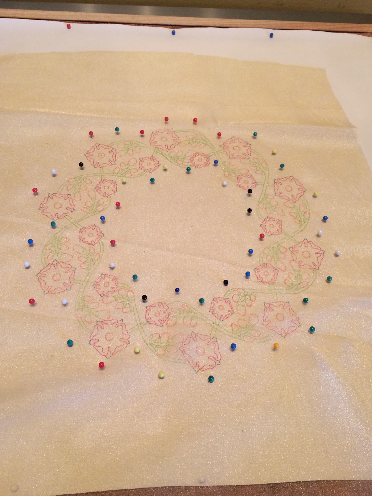
This is a stylised wreath design, 28cm (11") in diameter, with its underlying structure formed by two overlapping circular sine waves, which will form stems. The flowers themselves are roses and broom - planta genista - the original emblem of the Plantagenet family and the source of their name.
Traced onto gold organza in colour:
I'm going for a Yorkist version here so the roses are going to be white, but I need to be able to see the outline so I traced them in red as the finished embroidery will be appliquéd onto a dark red velvet. If I do a companion Lancastrian version then the roses will of course be red.
The traced design without the drawn version behind it:
Painted:
I'll start the outlining next time.
Showing posts with label Transferring a design to fabric. Show all posts
Tuesday, 27 January 2015
Sunday, 4 January 2015
Shaded snowdrop sample
Happy new year everyone! I hope you all had a great holiday and are now raring to go.
I'm starting the new year much as I finished the old one, with the snowdrop design, though for the last time (probably). This final time, I'm going to do it in colour.
So, here we go! Tracing the design onto silver organza:
Painting with diluted acrylic paints:
The green of the stems ran a bit into the brown of the roots, but never mind - it'll be covered with stitches.
Off the paper it had been pinned onto, and stretched onto a frame:
Stitching next!
I'm starting the new year much as I finished the old one, with the snowdrop design, though for the last time (probably). This final time, I'm going to do it in colour.
So, here we go! Tracing the design onto silver organza:
Painting with diluted acrylic paints:
The green of the stems ran a bit into the brown of the roots, but never mind - it'll be covered with stitches.
Off the paper it had been pinned onto, and stretched onto a frame:
Stitching next!
Thursday, 11 December 2014
White snowdrop sample
Same design, slightly different approach. This time, I want to see how it works in white-on-white. I'll be using the same cut-out-and-apply technique so it's not proper whitework, of course, but I'm interested to see how convincing - or otherwise! - it is.
So starting out the same as before, tracing the design onto silver organza with a light blue ultra-fine Sharpie pen:
The traced design taken off the drawn image that was beneath it in the first photo:
Painted white, and still on the paper:
Off the paper, onto a frame and ready to stitch:
It's a bit faint, but it's still easy enough to see, so I shouldn't struggle to stitch over the lines.
So starting out the same as before, tracing the design onto silver organza with a light blue ultra-fine Sharpie pen:
The traced design taken off the drawn image that was beneath it in the first photo:
Painted white, and still on the paper:
Off the paper, onto a frame and ready to stitch:
It's a bit faint, but it's still easy enough to see, so I shouldn't struggle to stitch over the lines.
Monday, 17 November 2014
Silver snowdrop sample
Another sample piece. You may remember that earlier this year when working on the Apple Tree fire screen I had a go at using Italian tubular mesh wire ribbon but it didn't work at all and I took it off.
This was the right thing to do for that particular project, but it's been at the back of my mind since that there must be something else I could do with it. This sample piece is an attempt to do just that, so we'll see how it works this time!
The design first. I'm using a slightly adapted version of a Victorian snowdrop motif I found on the British Library's Flickr site, which is well worth a browse if you have a few days to spare - it's a terrific time sink! It's also a marvellous resource for out-of-copyright images, so well worth checking out.
Anyway, the snowdrop:
I traced this onto some silver organza:
I've been experimenting with pens, and have opted for ultra-fine Sharpies: they have a very fine nib, they come in lots of colours, and - very importantly for this - they're colour fast and so won't run when I paint over them. As you can see, I've used a mid-blue for this.
The traced outline:
And painted over with acrylic paint thinned down with water:
It looks grey in the photo, but is silver in real life. It's still stuck to the paper the fabric is pinned to there; it'll be a lot paler once it's removed.
Ready to start sewing!
This was the right thing to do for that particular project, but it's been at the back of my mind since that there must be something else I could do with it. This sample piece is an attempt to do just that, so we'll see how it works this time!
The design first. I'm using a slightly adapted version of a Victorian snowdrop motif I found on the British Library's Flickr site, which is well worth a browse if you have a few days to spare - it's a terrific time sink! It's also a marvellous resource for out-of-copyright images, so well worth checking out.
Anyway, the snowdrop:
I traced this onto some silver organza:
I've been experimenting with pens, and have opted for ultra-fine Sharpies: they have a very fine nib, they come in lots of colours, and - very importantly for this - they're colour fast and so won't run when I paint over them. As you can see, I've used a mid-blue for this.
The traced outline:
And painted over with acrylic paint thinned down with water:
It looks grey in the photo, but is silver in real life. It's still stuck to the paper the fabric is pinned to there; it'll be a lot paler once it's removed.
Ready to start sewing!
Sunday, 5 October 2014
Acanthus leaf sample
After the Apple Tree fire screen, I want to do a couple more small sample pieces using the same techniques, to play about a bit with the shading and see what works. The first one I'm going to do is a classical acanthus leaf design:
While the fire screen used quite bold colours, I want this to be more subtle, and will be using a 'coffee and cream' colour scheme.
First things first, though. As previously, I'm working this on gold organza, and will cut the completed embroidery out and apply it to a background. I traced the design onto the organza (with a pen this time, rather than the almost-invisible pencil I used last time):
And off the design:
I then painted this with diluted acrylic paints:
This is still on the paper so the colours look stronger than they will once it's come off, but it shows the shading I'm aiming for quite nicely.
While the fire screen used quite bold colours, I want this to be more subtle, and will be using a 'coffee and cream' colour scheme.
First things first, though. As previously, I'm working this on gold organza, and will cut the completed embroidery out and apply it to a background. I traced the design onto the organza (with a pen this time, rather than the almost-invisible pencil I used last time):
And off the design:
I then painted this with diluted acrylic paints:
This is still on the paper so the colours look stronger than they will once it's come off, but it shows the shading I'm aiming for quite nicely.
Friday, 25 July 2014
Red bat - threads and the bat
With the bat design on the back of the fabric, I can start to stitch over it to mark it up on the front. It's going to be in red, so I used a red sewing thread to stitch over the bat outline (and only the bat outline at this stage), so that I can stitch over it properly:
What I'm going to stitch over it with was a bit of a conundrum, though. The background design is too small and detailed to make couching feasible, so Benton & Johnson metallic threads (the ones I used on the OBOD banner) weren't an option, and the Gutermann metallics I usually use for this sort of thing aren't available in red.
Time for some improvisation.
For the bat, I'm using two strands of Madeira stranded cotton no. 0211, a nice bright red, and two lengths of Gutermann Sulky machine embroidery thread no. 6014. This is also red and quite sparkly, what the manufacturers evidently call 'holographic'. The intention is to use all four lengths of thread in the needle at the same time. I haven't done this before, so we'll see how well it works!
What I'm going to stitch over it with was a bit of a conundrum, though. The background design is too small and detailed to make couching feasible, so Benton & Johnson metallic threads (the ones I used on the OBOD banner) weren't an option, and the Gutermann metallics I usually use for this sort of thing aren't available in red.
Time for some improvisation.
For the bat, I'm using two strands of Madeira stranded cotton no. 0211, a nice bright red, and two lengths of Gutermann Sulky machine embroidery thread no. 6014. This is also red and quite sparkly, what the manufacturers evidently call 'holographic'. The intention is to use all four lengths of thread in the needle at the same time. I haven't done this before, so we'll see how well it works!
Wednesday, 23 July 2014
Red bat - design and preparation
A new project to work on! This is quite a small piece, and shouldn't take too long to do, I don't think. The person it's for has asked for an outline of a bat against a patterned background. This is on a black fabric, and worked in red metallic thread. She's also specified a size: no more than 20 cm (about 8") square.
So, here's the design:
The 'crazy paving' background is a Voronoi diagram, which can be calculated mathematically, but is also found everywhere in nature as it's the most efficient way to arrange shapes of varying sizes on a flat surface. As such, it gives a nice organic look, and makes a nice change from precisely defined spirals and the like.
The fabric it's to be worked on is black silk matka, and I'm transferring the design in the usual way: making a transfer, ironing that onto some fine linen, attaching that to the back of the matka, and stitching over it to make the design on the back onto the front. Fiddly, but effective.
Here's the first stage, the transfer on the linen (already attached to the black matka, which is why it looks a bit dark):
I'll do the bat first, I think.
So, here's the design:
The 'crazy paving' background is a Voronoi diagram, which can be calculated mathematically, but is also found everywhere in nature as it's the most efficient way to arrange shapes of varying sizes on a flat surface. As such, it gives a nice organic look, and makes a nice change from precisely defined spirals and the like.
The fabric it's to be worked on is black silk matka, and I'm transferring the design in the usual way: making a transfer, ironing that onto some fine linen, attaching that to the back of the matka, and stitching over it to make the design on the back onto the front. Fiddly, but effective.
Here's the first stage, the transfer on the linen (already attached to the black matka, which is why it looks a bit dark):
I'll do the bat first, I think.
Labels:
Designing,
Fabrics,
Transferring a design to fabric
Wednesday, 9 July 2014
Apple tree fire screen - getting the background ready
Although the embroidery was done onto organza, that's not the final fabric for the finished piece, which is an ivory cotton velvet. With all the embroidery completed, it's time to get that ready.
I'm going to be applying the embroidery to the velvet background, so in order to make sure I get it on straight, I traced some key points in the design with a transfer pencil, and ironed them onto a piece of linen:
I stitched this to the back of the velvet, then stitched over the lines with a dark yellow sewing thread, to transfer them onto the front:
Time to add the embroidery, so I can't put the next stage off any longer.
I'm going to be applying the embroidery to the velvet background, so in order to make sure I get it on straight, I traced some key points in the design with a transfer pencil, and ironed them onto a piece of linen:
I stitched this to the back of the velvet, then stitched over the lines with a dark yellow sewing thread, to transfer them onto the front:
Time to add the embroidery, so I can't put the next stage off any longer.
Saturday, 26 April 2014
Apple Tree fire screen - painting
The next stage in the process is definitely new for me: painting the fabric.
I used diluted acrylic paints, and very carefully painted in the stems in gold:
(the forest of map pins are to stop the fabric shifting as I worked)
Then the leaves in green:
And finally the apples in red:
The colours look very bright here, but most of the paint went straight through the weave of the fabric and onto the paper beneath; off the paper and stretched onto an embroidery frame, it's a lot more muted:
Time to start stitching!
I used diluted acrylic paints, and very carefully painted in the stems in gold:
(the forest of map pins are to stop the fabric shifting as I worked)
Then the leaves in green:
And finally the apples in red:
The colours look very bright here, but most of the paint went straight through the weave of the fabric and onto the paper beneath; off the paper and stretched onto an embroidery frame, it's a lot more muted:
Time to start stitching!
Wednesday, 23 April 2014
Apple Tree fire screen - the design
I'm going to make a fire screen based on the 'apple tree' design on my late 19th century wardrobe, which to remind you, looks like this:
I also mentioned last time that I'm intending to try a slightly different technique. If any of you are fans of Game of Thrones (I am!) you'll have seen the fabulous work of costume embroiderer Michele Carragher - be sure to have a good look round her site as her work really is amazing. As well as spectacular photos, Ms Carragher also generously provides a lot of detail on her site of how she produces her embroidery, and for this piece I'm going to be following the techniques she describes.
In some ways it's similar to how I've done things in the past - embroidering onto a fine fabric, cutting it out then applying the slip to a background fabric - but sufficiently different to be new and fun!
Firstly, I've drawn out the apple tree design, scanned it, and blown it up to approximately A3 size (the actual embroidery will be 22 cm x 38 cm, or around 8.5" x 15"):
I'm going to be stitching onto a gold organza, so to mark the design onto it I pinned the organza over the drawing, and drew over it with a dark yellow pencil:
Here it is without the drawing and pinned onto some scrap paper:
Usually at this point I say that it's just the photo and it's a lot clearer in real life - not in this instance! It really is a bit faint, but that doesn't matter too much as I only need to be able to see it for a short while. Why? I'll tell you next time!
I also mentioned last time that I'm intending to try a slightly different technique. If any of you are fans of Game of Thrones (I am!) you'll have seen the fabulous work of costume embroiderer Michele Carragher - be sure to have a good look round her site as her work really is amazing. As well as spectacular photos, Ms Carragher also generously provides a lot of detail on her site of how she produces her embroidery, and for this piece I'm going to be following the techniques she describes.
In some ways it's similar to how I've done things in the past - embroidering onto a fine fabric, cutting it out then applying the slip to a background fabric - but sufficiently different to be new and fun!
Firstly, I've drawn out the apple tree design, scanned it, and blown it up to approximately A3 size (the actual embroidery will be 22 cm x 38 cm, or around 8.5" x 15"):
I'm going to be stitching onto a gold organza, so to mark the design onto it I pinned the organza over the drawing, and drew over it with a dark yellow pencil:
Here it is without the drawing and pinned onto some scrap paper:
Usually at this point I say that it's just the photo and it's a lot clearer in real life - not in this instance! It really is a bit faint, but that doesn't matter too much as I only need to be able to see it for a short while. Why? I'll tell you next time!
Wednesday, 19 February 2014
Why I use running stitches to transfer designs
I've mentioned often in the past that I use small running stitches over a design marked up on the back of a piece to transfer it to the front. This sounds like - and is - a lot of work: I have to mark the design onto the back somehow (an iron-on transfer on lining fabric, usually, but it could be traced, prick and pounced, etc), and then have the effort of stitching over it with stitches that are not intended to be seen as part of the finished item. Why do I bother, when it would be quicker and easier to mark up the front in the first place?
This is why.
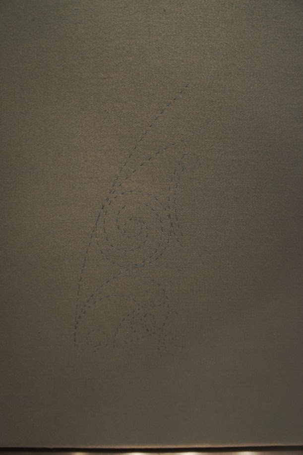
Here's a part of the design with the running stitches marking out the design:
The lines are rather wobbly as the running stitches are going through several layers of fabric (the linen lining, the cotton sateen background, the Vilene lining of the appliqué section and the silk of the appliqué itself) and it's hard to keep them as straight on the front as they are on the back, especially with a design this complex, but I'm more interested in the shape of the spiral. It looks wrong - the part over the central circle is too high.
So, when I added the couched thread, I ignored that bit of the transferred design and put it where I felt it ought to go instead:
That leaves the stitches of the original line (and the wobbly ones) on show, but a quick bit of unpicking later and voilà!
They're gone, and you'd never know they'd been there.
If the design was marked on with pen or some other more or less permanent medium, I couldn't change my mind, or not easily. This way, I can make changes as I go, plus I don't have to worry about lines showing through, or ink spreading and making a mess of the fabric.
So yes, it takes more time and effort, but it saves a lot of heartache. I can recommend it.
This is why.
Here's a part of the design with the running stitches marking out the design:
The lines are rather wobbly as the running stitches are going through several layers of fabric (the linen lining, the cotton sateen background, the Vilene lining of the appliqué section and the silk of the appliqué itself) and it's hard to keep them as straight on the front as they are on the back, especially with a design this complex, but I'm more interested in the shape of the spiral. It looks wrong - the part over the central circle is too high.
So, when I added the couched thread, I ignored that bit of the transferred design and put it where I felt it ought to go instead:
That leaves the stitches of the original line (and the wobbly ones) on show, but a quick bit of unpicking later and voilà!
They're gone, and you'd never know they'd been there.
If the design was marked on with pen or some other more or less permanent medium, I couldn't change my mind, or not easily. This way, I can make changes as I go, plus I don't have to worry about lines showing through, or ink spreading and making a mess of the fabric.
So yes, it takes more time and effort, but it saves a lot of heartache. I can recommend it.
Sunday, 16 February 2014
Druid banner - blue spirals on the appliqué trilithon
Lots of progress to show you today!
The white appliqué trilithon looks very stark on its own, but it's not staying like that. I want to integrate it into the overall design by continuing the spiral pattern over the top of it.
As ever, the first step is to go over the design on the back with small running stitches to transfer it to the front, and this time it's actually visible:
You can already see how it's going to work!
I'm using Benton & Johnson metallic passing thread in "Ocean Blue", couched with Gutermann Sulky machine embroidery thread number 1250.
This is plain rather than variegated, and a slightly darker shade than the one used for the background.
And as I've been busy, I've even more to show you - some of the spirals already done:
You should be able to see how the design works across the whole piece. It's coming on!
The white appliqué trilithon looks very stark on its own, but it's not staying like that. I want to integrate it into the overall design by continuing the spiral pattern over the top of it.
As ever, the first step is to go over the design on the back with small running stitches to transfer it to the front, and this time it's actually visible:
You can already see how it's going to work!
I'm using Benton & Johnson metallic passing thread in "Ocean Blue", couched with Gutermann Sulky machine embroidery thread number 1250.
This is plain rather than variegated, and a slightly darker shade than the one used for the background.
And as I've been busy, I've even more to show you - some of the spirals already done:
You should be able to see how the design works across the whole piece. It's coming on!
Sunday, 1 December 2013
Druid banner - getting the design onto the front
Last time, I'd mounted the fabric to be stitched onto an embroidery frame, complete with a back-to-front ironed-on transfer of the design on the back:
That's all very well, but I need the design on the front, in order to stitch it. Now what?
To get the design from the back of the fabric onto the front, I stitched over the transferred design on the back with small running stitches:
Here, I've done the section on the right, to one side of the 'trilithon'. I've used a fairly dark blue sewing thread, so that later on it won't be seen.
This has the rather unfortunate side effect that it can't really be seen in my photographs, either.
I'm afraid photography isn't my strongest suit (I expect you've realised that!) and I've done my best, but it's not marvellous and it makes the green fabric look a nasty muddy colour that is not how it looks in real life at all. Anyway, if you peer at it as best you can, you should be able to see the design in a dotted line formed by the running stitches on the front fabric.
There's a brief overview of different methods of transferring a design to fabric here, but despite being by far the most time-consuming, this is definitely my favourite. It's great for getting a design onto dark fabric where other methods are hard to see, and, most importantly, it doesn't mark the top fabric at all. If I decide a line is in the wrong place I can just unpick the stitches and it's as though it was never there, while all other methods that mark up the top fabric can leave traces that can be very difficult to get rid of. It might take a while to do, but it's worth it.
Back to the design. I'm going to be building it up in stages, which should make sense as I go along. The first stage is the spirals in the top, blue, half outside of the trilithon. Once all the running stitches have been done over the design on the back, I have all the design for the part I'll be working on first transferred to the front:
Time to start proper stitching!
That's all very well, but I need the design on the front, in order to stitch it. Now what?
To get the design from the back of the fabric onto the front, I stitched over the transferred design on the back with small running stitches:
Here, I've done the section on the right, to one side of the 'trilithon'. I've used a fairly dark blue sewing thread, so that later on it won't be seen.
This has the rather unfortunate side effect that it can't really be seen in my photographs, either.
I'm afraid photography isn't my strongest suit (I expect you've realised that!) and I've done my best, but it's not marvellous and it makes the green fabric look a nasty muddy colour that is not how it looks in real life at all. Anyway, if you peer at it as best you can, you should be able to see the design in a dotted line formed by the running stitches on the front fabric.
There's a brief overview of different methods of transferring a design to fabric here, but despite being by far the most time-consuming, this is definitely my favourite. It's great for getting a design onto dark fabric where other methods are hard to see, and, most importantly, it doesn't mark the top fabric at all. If I decide a line is in the wrong place I can just unpick the stitches and it's as though it was never there, while all other methods that mark up the top fabric can leave traces that can be very difficult to get rid of. It might take a while to do, but it's worth it.
Back to the design. I'm going to be building it up in stages, which should make sense as I go along. The first stage is the spirals in the top, blue, half outside of the trilithon. Once all the running stitches have been done over the design on the back, I have all the design for the part I'll be working on first transferred to the front:
Time to start proper stitching!
Sunday, 24 November 2013
Druid banner - transferring the design and getting set up
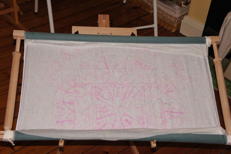
So, I have a transfer of the design. Now what? I'll get onto the fabric for the front of the banner in a moment, but right now you need to know that it's going to be lined with a fine linen. This won't be seen, but acts to support and strengthen the top fabric. It also comes in very handy as a means of transferring the design without risking getting marks on the top fabric that you don't want.
The transfer is heat activated, and needs to be ironed on. I stitched it transfer side down to a piece of linen cut to size:
There's always a danger when ironing it that the transfer might shift slightly, which can lead to smudging or double lines. The larger the design the more likely this is to happen, and the more complex the design the more of a problem this is to work with later. As this is both large and complex, I was very careful indeed with fastening the tracing paper to the linen, tacking it down in a grid pattern, with lines of stitching roughly 5 cm (2") apart.
If you're paying attention you'll have spotted that as the traced side is face down, the text is now back to front. Don't worry, it's meant to be like that!
After some very careful ironing, I took out all the tacking stitches and cautiously removed the paper:
Fortunately, it's fine, which was a relief! It looks rather faint in the photo, and some areas were faint enough for me to go over them with a pencil to make them clearer, but in real life it's going to be fine to work with.
The next step is to attach the linen to the top fabric, the one that'll be seen. Regulars will know I tend to work with silk, but in this case I didn't think it was appropriate. I want the banner to be robust enough to be used in outdoor events, which in the UK will mean suitable for use in all weathers. As such, I've chosen a cotton sateen, in jade green. This is still a natural fabric, is hard-wearing, has a nice sheen to it, and as it was often the fabric of choice for miners' banners, traditionally paraded through the streets of mining communities in Northern England, should be able to stand a bit of rain.
This was also cut to size, tacked to the linen, and using an overlocker, the edges were neatened and the two pieces of fabric joined together:
(I cut and joined the fabric for the back of the banner too, but as that's going to be left plain we can ignore that from now on.)
It was then stretched in a frame ready to start sewing. I have a frame wide enough (just!) for the width of the banner fabric, but it has to be rolled onto the top and bottom bars, leaving an exposed area to stitch on, which will need to be moved as I progress. As when it's rolled the transfer on the back will be in contact with the fabric on the front and I don't want to risk any rubbing off and marking it, I placed some muslin over the top before I rolled it, so if any of the transfer does rub off, it'll do so onto that.
That's a lot of preparation, but it's all absolutely necessary to do a proper job. Now it's time to start sewing!
The transfer is heat activated, and needs to be ironed on. I stitched it transfer side down to a piece of linen cut to size:
There's always a danger when ironing it that the transfer might shift slightly, which can lead to smudging or double lines. The larger the design the more likely this is to happen, and the more complex the design the more of a problem this is to work with later. As this is both large and complex, I was very careful indeed with fastening the tracing paper to the linen, tacking it down in a grid pattern, with lines of stitching roughly 5 cm (2") apart.
If you're paying attention you'll have spotted that as the traced side is face down, the text is now back to front. Don't worry, it's meant to be like that!
After some very careful ironing, I took out all the tacking stitches and cautiously removed the paper:
Fortunately, it's fine, which was a relief! It looks rather faint in the photo, and some areas were faint enough for me to go over them with a pencil to make them clearer, but in real life it's going to be fine to work with.
The next step is to attach the linen to the top fabric, the one that'll be seen. Regulars will know I tend to work with silk, but in this case I didn't think it was appropriate. I want the banner to be robust enough to be used in outdoor events, which in the UK will mean suitable for use in all weathers. As such, I've chosen a cotton sateen, in jade green. This is still a natural fabric, is hard-wearing, has a nice sheen to it, and as it was often the fabric of choice for miners' banners, traditionally paraded through the streets of mining communities in Northern England, should be able to stand a bit of rain.
This was also cut to size, tacked to the linen, and using an overlocker, the edges were neatened and the two pieces of fabric joined together:
(I cut and joined the fabric for the back of the banner too, but as that's going to be left plain we can ignore that from now on.)
It was then stretched in a frame ready to start sewing. I have a frame wide enough (just!) for the width of the banner fabric, but it has to be rolled onto the top and bottom bars, leaving an exposed area to stitch on, which will need to be moved as I progress. As when it's rolled the transfer on the back will be in contact with the fabric on the front and I don't want to risk any rubbing off and marking it, I placed some muslin over the top before I rolled it, so if any of the transfer does rub off, it'll do so onto that.
That's a lot of preparation, but it's all absolutely necessary to do a proper job. Now it's time to start sewing!
Tuesday, 19 November 2013
Druid banner - making a transfer
Last time, I told you about my new project, and showed you my design, and now I'm making a start. Regular readers will have seen the process of transferring a design to fabric and getting this set up before, but in case there are any new readers following this project, I'll cover the process in some detail.
The colour designs are good to give an idea of what the finished item should look like, but in order to mark up fabric to stitch, however, it's better to have a black and white version:
I got this printed out full size at a local copy shop; here it is, taped to my dining table, as it's too big for the table in my sewing room:
The first step is to make a transfer from this. You can buy special transfer pencils, so with a large piece of tracing paper taped over the top, it's just a case of carefully drawing over the lines:
It's a bit hard to tell, but if you look closely, you can see that the central spiral is a bit pink, from the transfer pencil line.
It's even harder to tell here, so you'll just have to take my word for it that I've traced the entire design:
Having the transfer is one thing, but next I need to apply it to the fabric itself. That's next!
The colour designs are good to give an idea of what the finished item should look like, but in order to mark up fabric to stitch, however, it's better to have a black and white version:
I got this printed out full size at a local copy shop; here it is, taped to my dining table, as it's too big for the table in my sewing room:
The first step is to make a transfer from this. You can buy special transfer pencils, so with a large piece of tracing paper taped over the top, it's just a case of carefully drawing over the lines:
It's a bit hard to tell, but if you look closely, you can see that the central spiral is a bit pink, from the transfer pencil line.
It's even harder to tell here, so you'll just have to take my word for it that I've traced the entire design:
Having the transfer is one thing, but next I need to apply it to the fabric itself. That's next!
Subscribe to:
Posts (Atom)